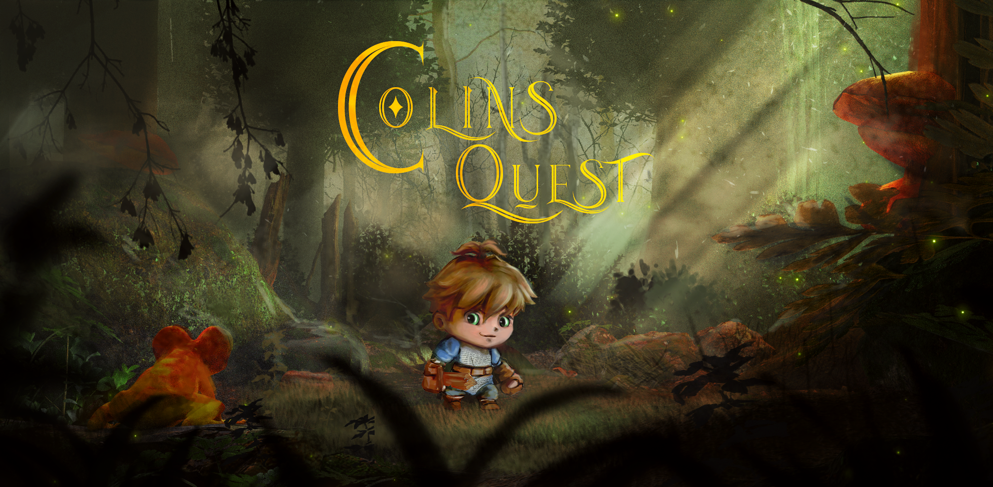
Colins Quest is a 2D Fantasy jump & Run Game in Development by me and my brother. Inspired by Little Nightmares, Hollow Knight, Ori, Grounded and Zelda.
This Game is in very early Development, no story has been written yet, but the overall Idea for the Game is, to see the world through the eyes of a child and following our main protagonist “Colin” through his adventure.
My Tasks
Character & Environment Design
UI & Brand - Design
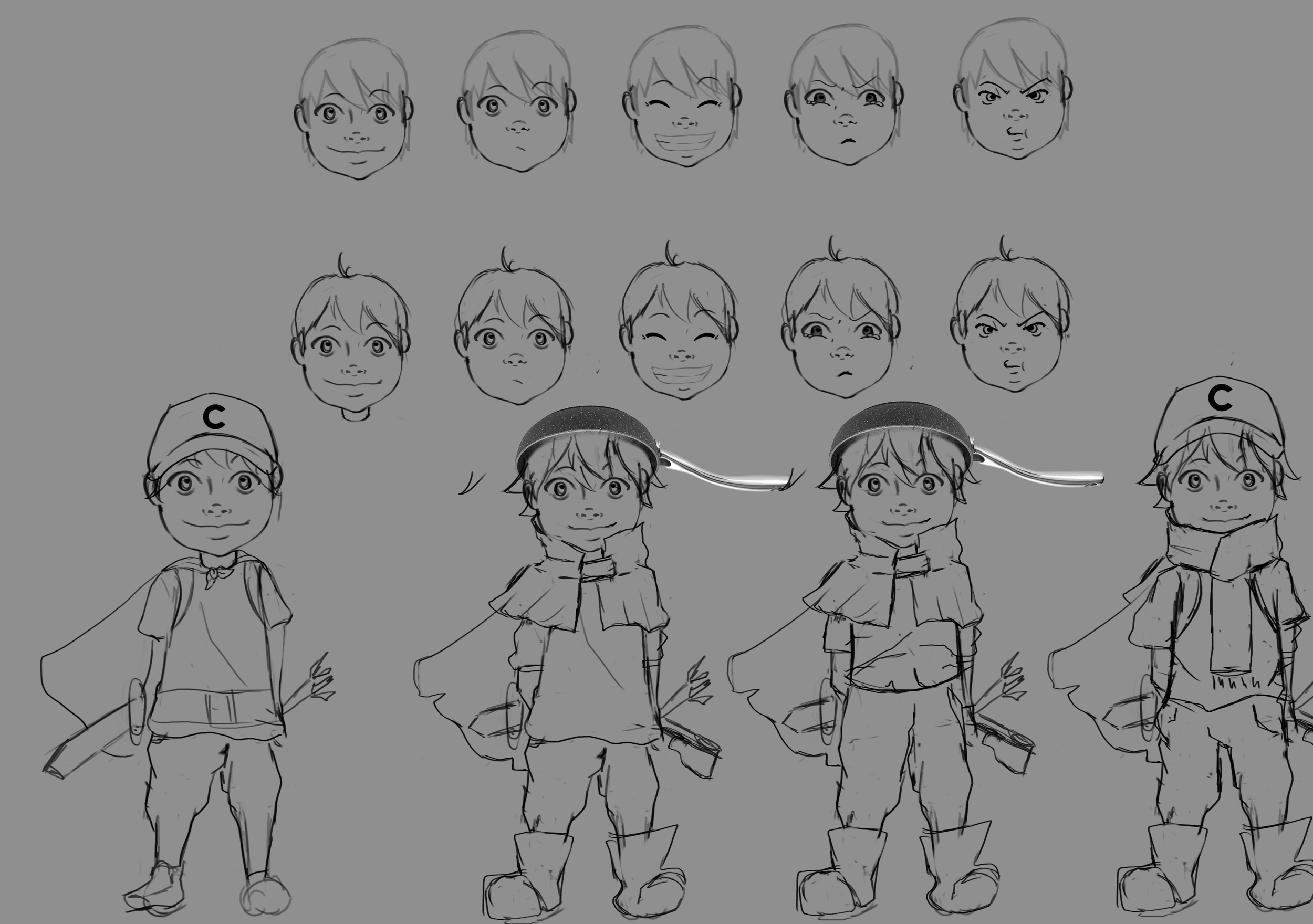
Character Design
My Nephew was the best example. Adventurous, Curious nature, his love for knights, games and swords were the perfect fit for the character of the game and guess what, his name is Colin. My Research was all about him, what kind of hero he wanted to be, what his favorite color was, which weapons he would wear and you could definitely say he has a lot of fantasy that made me wanted to jump right into work.
I did pictures of different poses and perspectives of him first, to study the movement and his expression. (Due to privacy i sadly can not share those pictures) Thanks to those References, i could do a very rough sketch of the character and studies expressions that could be used later in the game animations.
I wanted to go with a simple but Silly Design to show the childish nature of the character. However, I understood that the overall style I adapted here would be a bit of a challenge to animate. It would be fine for an animation movie, but not likeable for an actual 2D game. At least in my opinion.
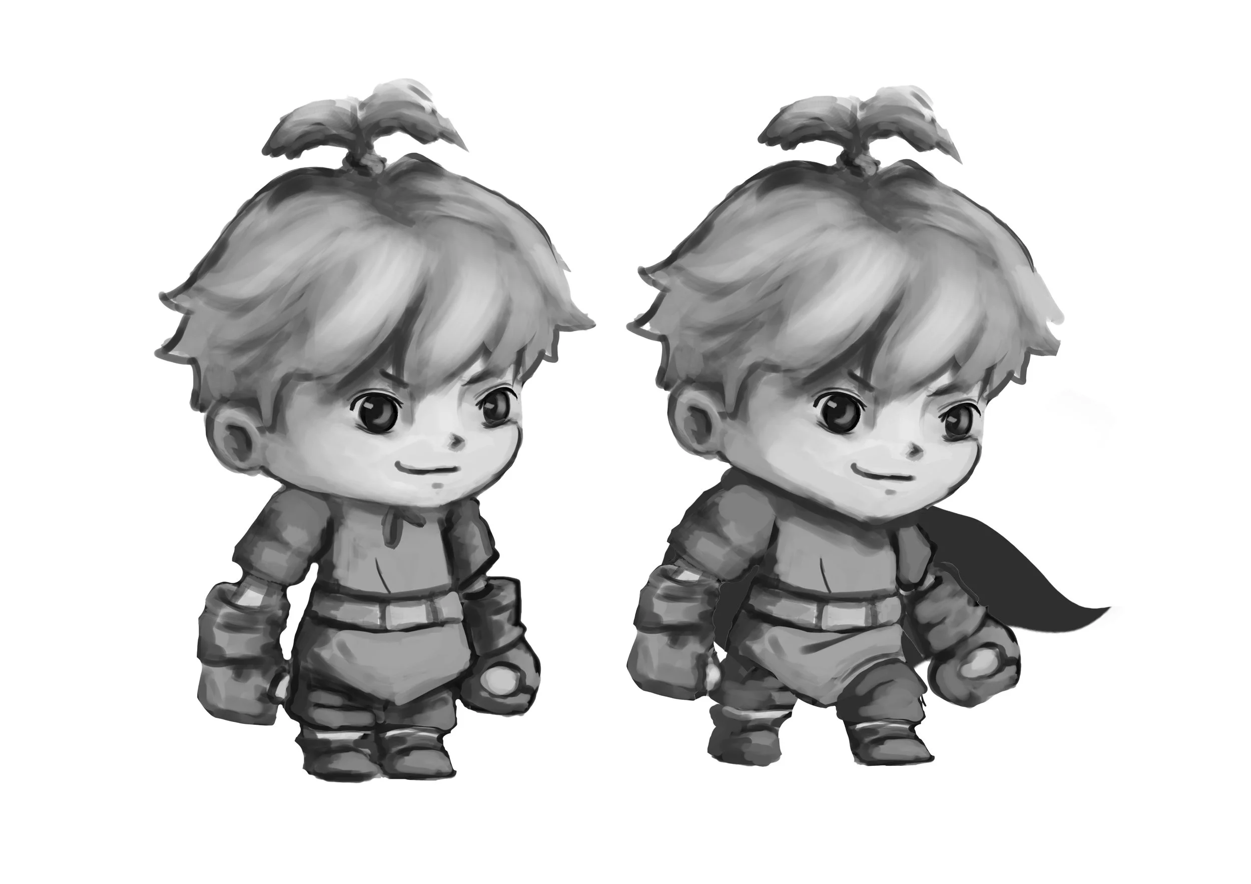
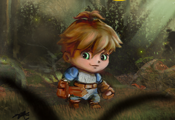
For me, it lacked the Essence of a Child and I did more research on difference Styles, deciding on a cute Chibi Style, that would be easier to animate but probably more likeable in appearance for a bigger group of Gamers out there.
His Expressions his movement however shouldn’t be all too childish, taking a more serious look, gives the character a more courageous and adventurous nature, which makes the character more believable.
My Nephew loves to wear his hair in a ponytail and immediately had to think of Tales from sonic.
So what if one of his abilities would be to jump higher due to his hair that swirls around like Tales Tail? Funny right?
So I had to add this Detail and thought about a way simpler design for the Clothes. I took some more research and loved the simple Designs of the early Gameplay in Fable with the big gloves, which inspired me to take that idea for this character just as well.
The Torso should be a simple Tunika, like all the young boys on carnival wearing, when they would act like a knight. The simple Cape was inspired by the carnival idea but also by Life is Strange - Captain Spirit. They adapted that childish nature perfectly in this game.
Environment
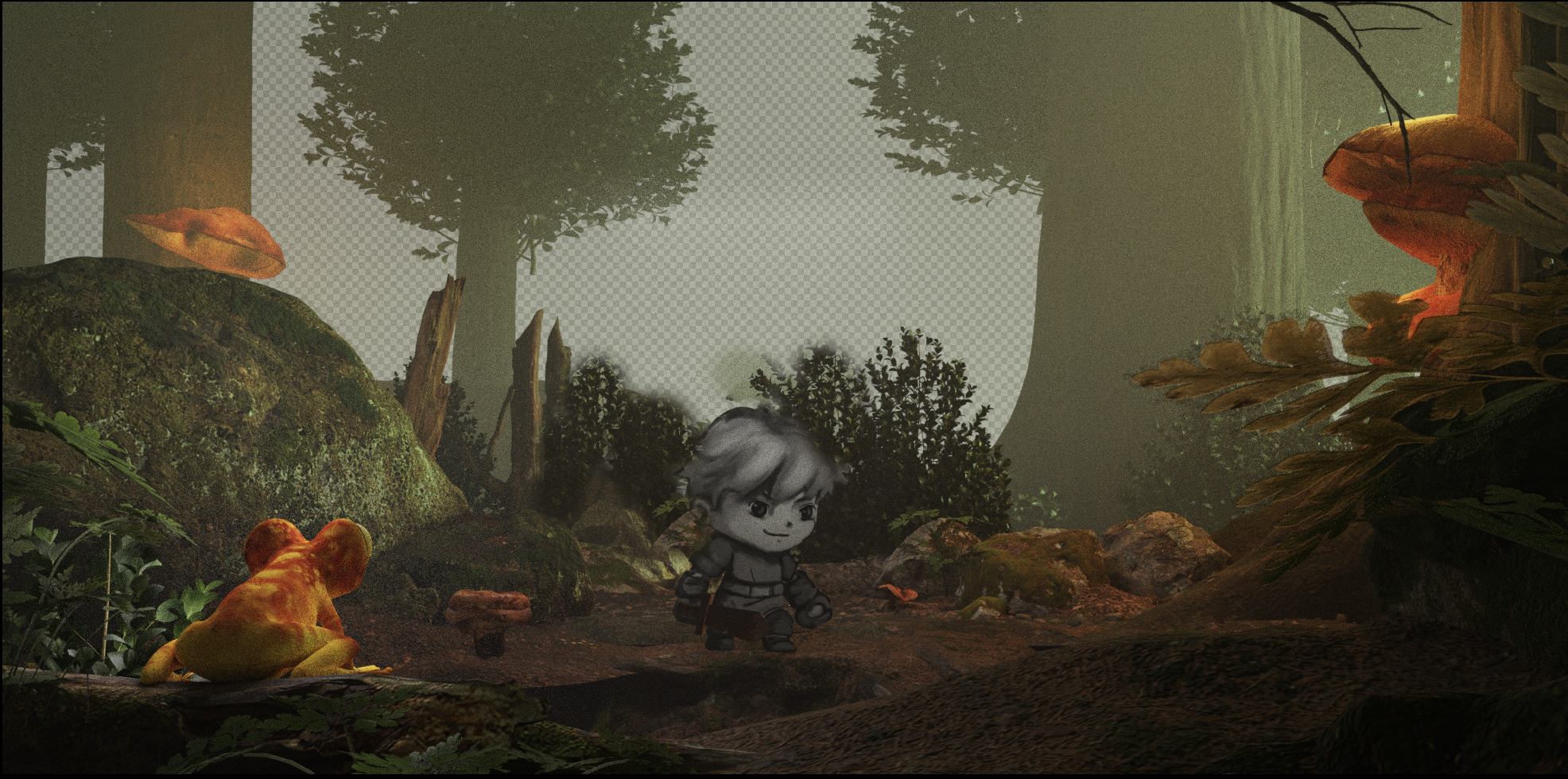
Inspired by grounded, the world seems way bigger to a child than to an adult. In a Fantasy setting like Alice in Wonderland, things in general are different as they normally seem. Even though the Design of the Character seems to be simple and childish, I thought the environment should be a bit of a contrast to that to make it more mysterious and “creepy” as to symbolize the big & unknown for a child. I did the Base in Blender with Assets from Quixel Bridge.
Ori was the best example for a more “layered” design. Foreground - Main - Background. Animating such a level design wouldn’t be all too hard for me alone.
I loved the Idea of combining 3D with 2D, as it would be a unique look that could be rememberable. However, after I finished the 3D Base I continued to Photobash and Paint in Photoshop the different Layers, made color corrections and lastly designed the Logo.
The Logo is just a first design. My second thought would concentrate on a more Retro but Fantasy Vibe, still need to think a bit more into this.

USER INTERFACE
Within the Early Development Stages from Veil of Ashes, formerly Called E.I.S.E.N, I supported the Team from Greifenmaer Game Studio forming the very first Stages of the UI-Design, until my Bachelor Project collided with the Game Development.
Stylistic description
The style should be based on the scenario and convey a rather melancholy, gloomy impression. The size ratio between menu items and background should be based on the references.
References Anno 1800 & Iron Harvest
My Tasks
A rough draft of the main menu. Placement of elements and aesthetics are important here. Graphics do not have to be perfectly worked out; any suitable placeholders can be used as images.
Existing elements of the menu are listed below.
Menu left-aligned or centered:
Multiplayer
Editor
Options
Quit Game
Game title
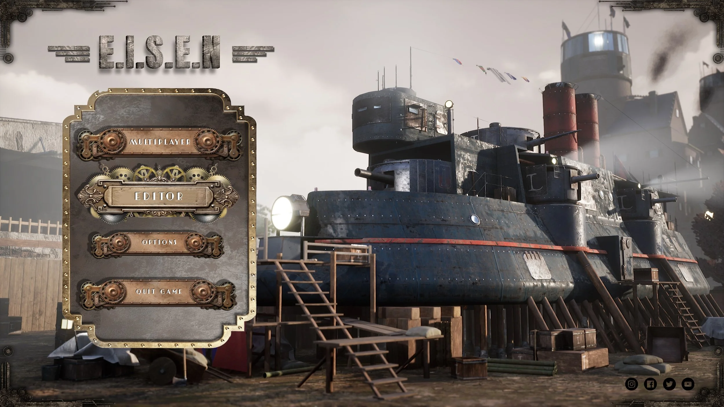
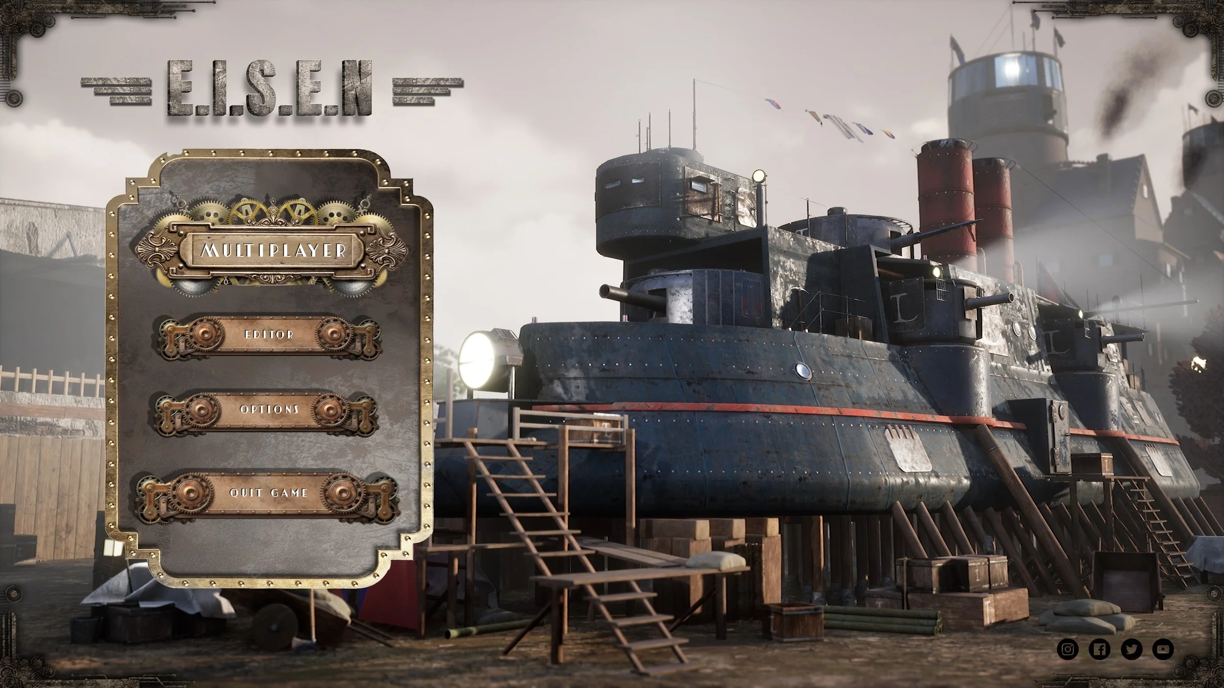
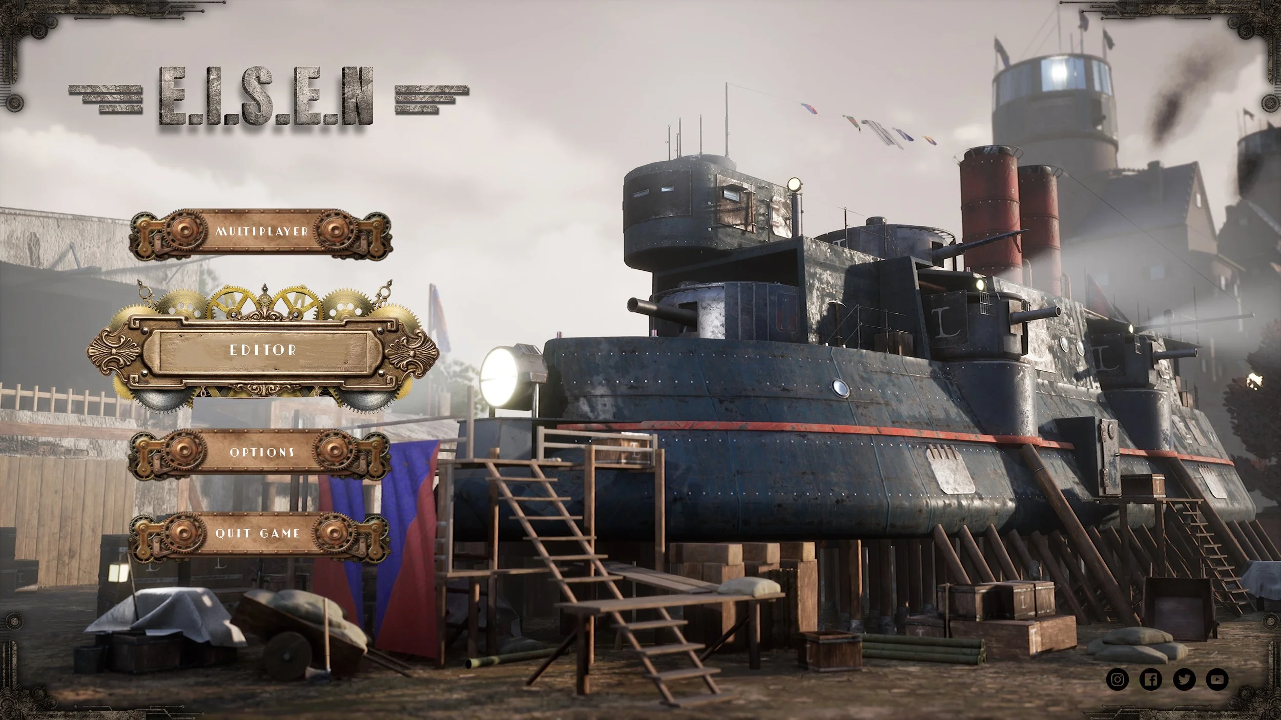
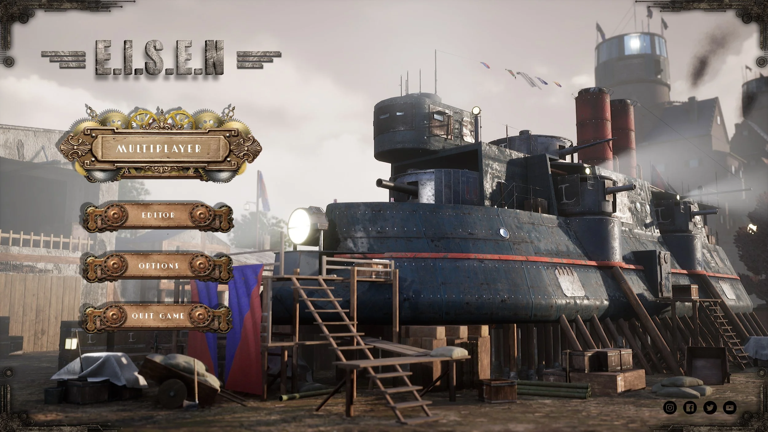
Veil of Ashes - Early Development Menu UI
How I worked:
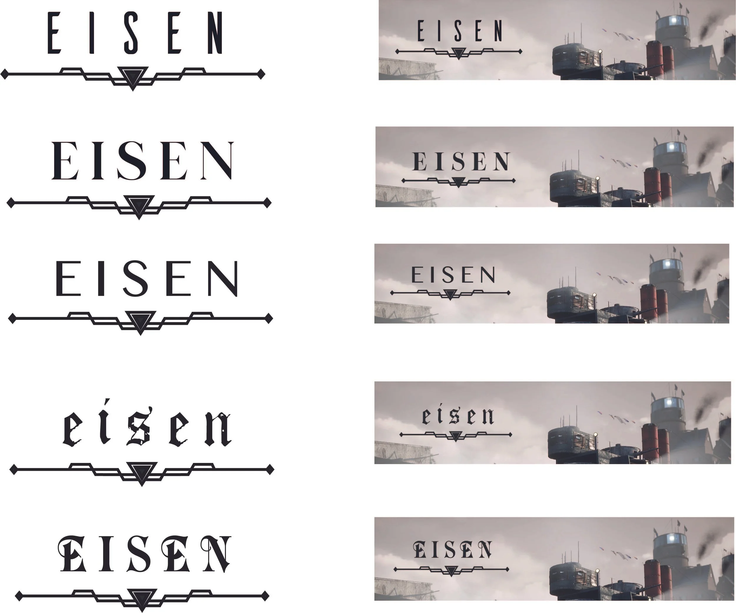
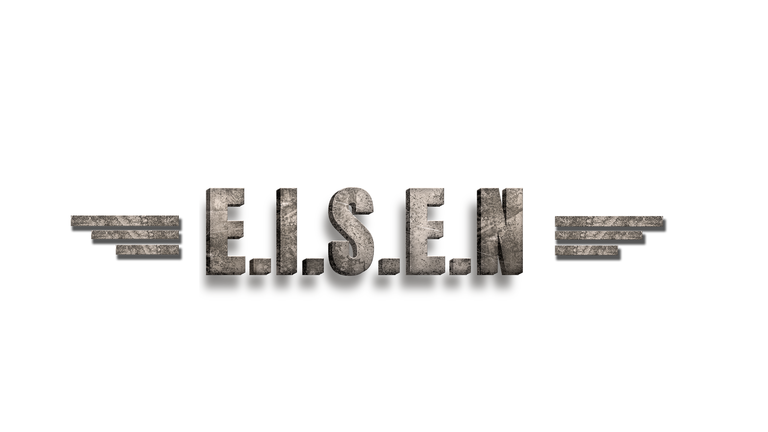
I first inspired myself and researched about the Type of Game and other UI Designs. Since UI is a big part of the Game’s Branding, I wanted to make sure to transport the right look and feel. Starting with the Logo, I made several Designs, discussed it with the Team and came to the conclusion that a more industrial and 3D look would be a greater fit for the design than a minimalistic one, as shown on the first designs.
Since the overall concept was about ships and more moody and industrial, I decided to go with a more Steampunk inspired style on the Home Menu UI - Design, capturing the industrial flair of the whole game. I was a bit inspired by Bioshok. Even though it’s a whole other genre than our game, the industrial flair through the Big Daddies and City System of Bioshok Games had a big influence on me, as well as the References Anno 1800 and Iron Harvest shown above. All of those UI-Designs have a copper-brown-silver like color theme which is often used in more Steampunk related Games and Designs.


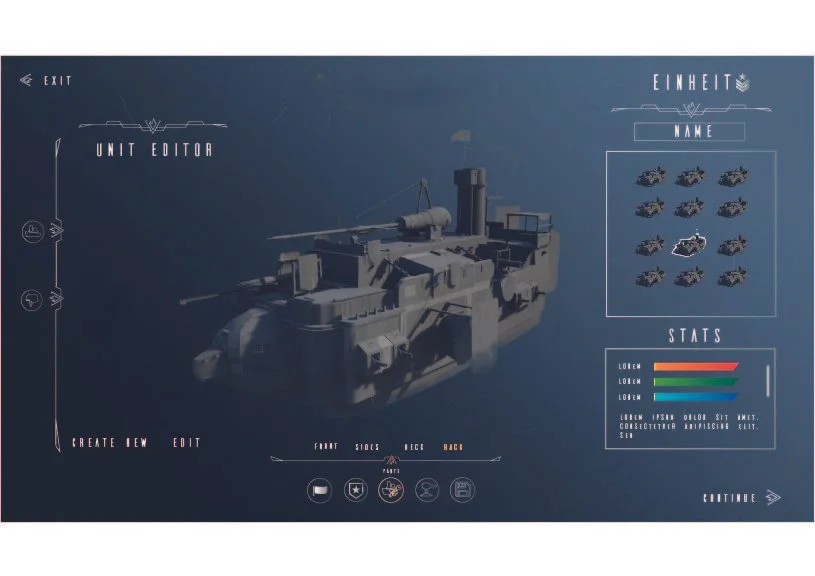
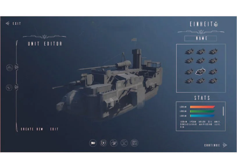
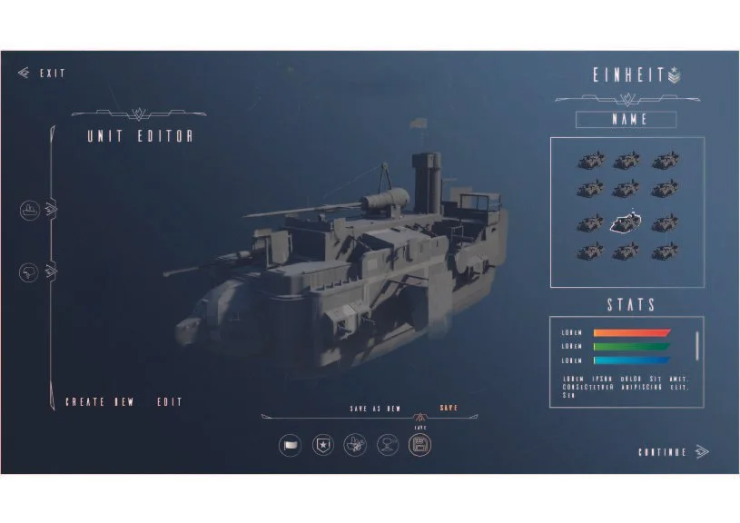
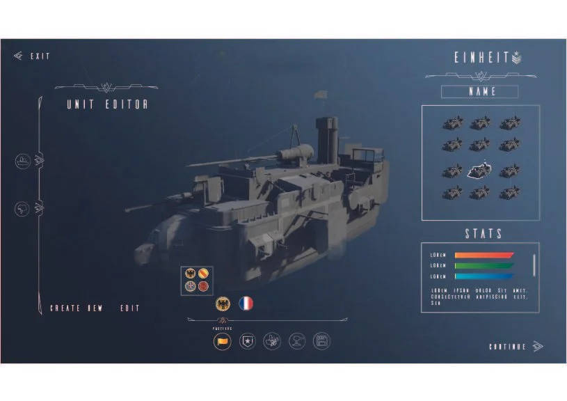
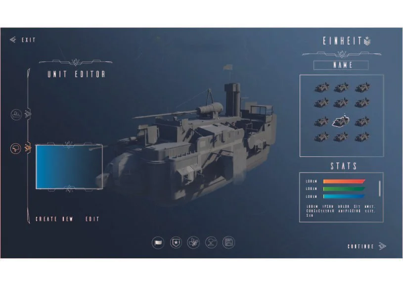
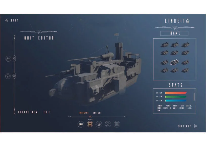
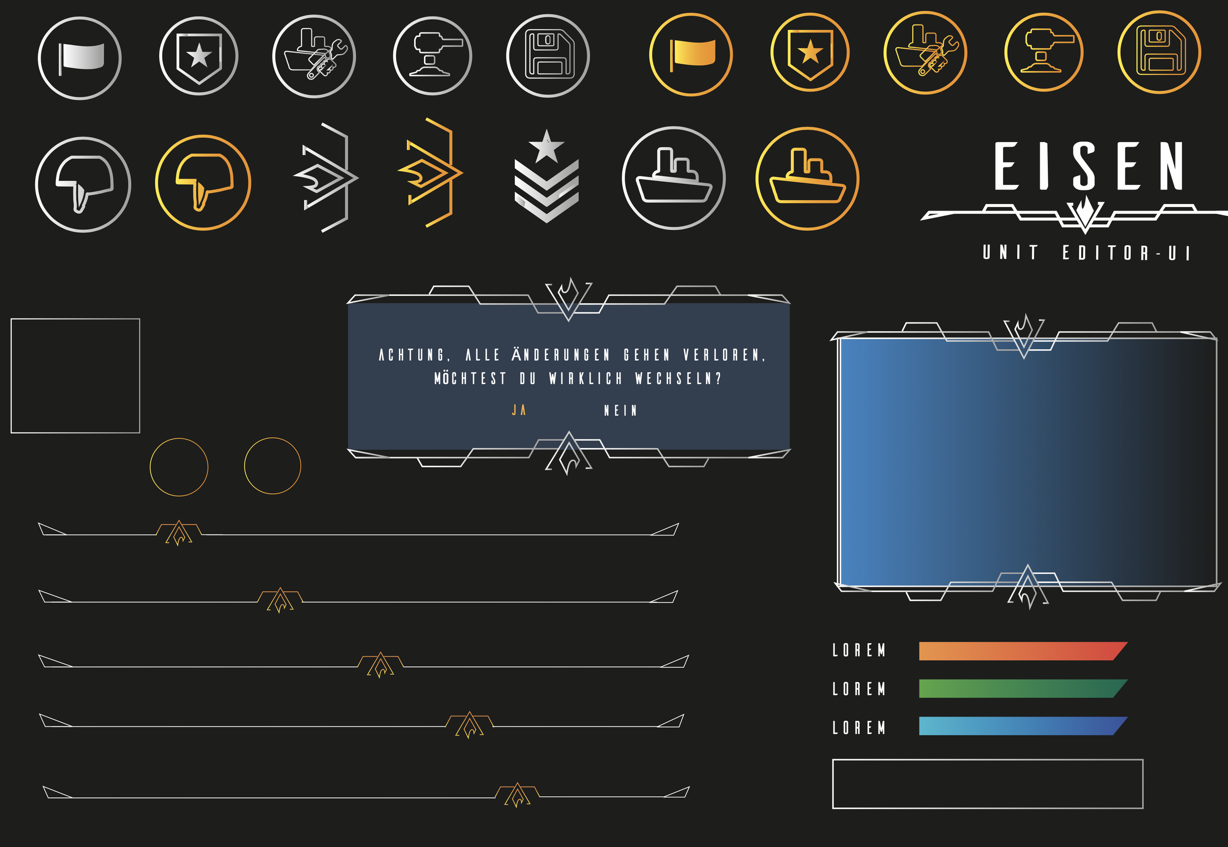
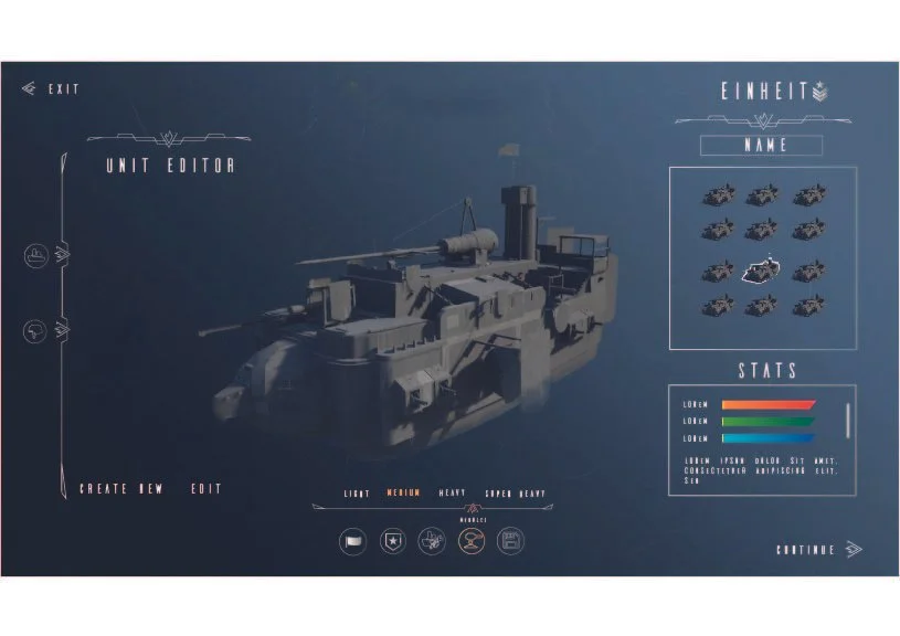
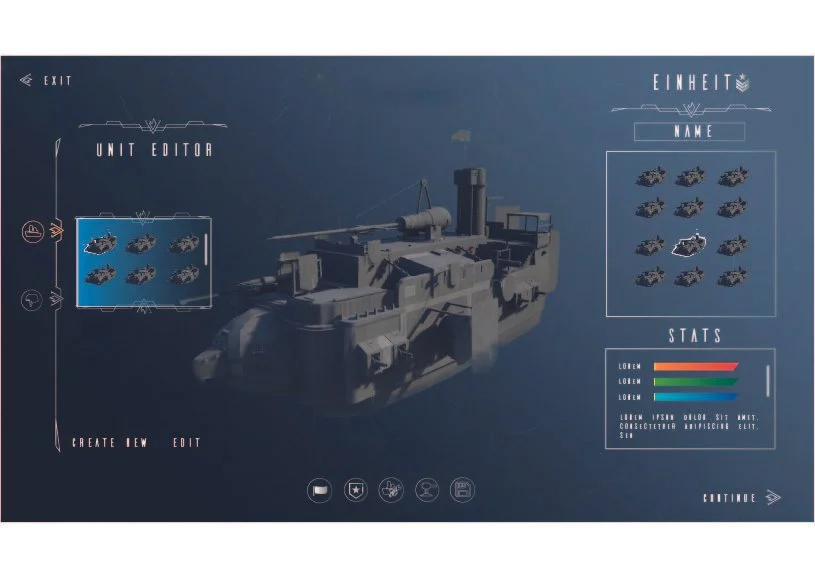
Unit Editor - UI
Another Task was to demonstrate the UI of the editor. In this video, I show the different settings and the corresponding UI design that should be built into the editor.
